chess
Inspiration
This project is inspired by this reddit post. In that reddit post, the op analyzed and made a plot about total distance traveled by GM Magnus Carlsen’s Chess pieces over his career. It was a very interesting post and was done in Python in Google Colab utilizing chess-python and pandas libraries. Visualization generated with Seaborn library. I would like to replicate the idea practicing with R and explored something different.
Read Data
The data can be downloaded from http://www.pgnmentor.com/files.html
Once downloaded, thanks for the R package bigchess, we can easilly read the moves and games from pgn file to dataframe.
df  = read.pgn("Carlsen.pgn")

## 2021-02-21 20:32:20, successfully imported 3430 games

## 2021-02-21 20:32:20, N moves computed

## 2021-02-21 20:32:20, extract moves done

## 2021-02-21 20:32:22, stat moves computed

# glimpse(df)
Data Manipualtion
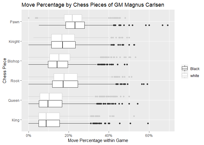
Let’s filter the data by GM Magnus Carlsen, and record his moves overall by Bishop, King, Knight, Queen, and Rook.
## white
white = df %>%
  filter(str_detect(White, "Carlsen,M")) %>%
  mutate(name = White,
         player = "white",
         isWhite = TRUE,
         MC_result = case_when(
           Result == '1-0' ~ 'W',
           Result == '0-1' ~ 'L',
           Result == '1/2-1/2' ~ 'D'
         ),
         B_moves = W_B_moves,
         K_moves = W_K_moves,
         N_moves = W_N_moves,
         O_moves = W_O_moves,
         Q_moves = W_Q_moves,
         R_moves = W_R_moves,
         P_moves = NMoves - W_B_moves - W_K_moves - W_N_moves - W_Q_moves-W_R_moves - W_O_moves) %>%
  mutate(MC_result = factor(MC_result, levels=c("W", "D", "L"))) %>%
  select(name, player, MC_result, NMoves, B_moves, K_moves, N_moves, Q_moves, R_moves, P_moves, O_moves)

black = df %>%
  filter(str_detect(Black, "Carlsen,M")) %>%
  mutate(name = Black,
         player = "Black",
         isWhite = FALSE,
         MC_result = case_when(
           Result == '1-0' ~ 'L',
           Result == '0-1' ~ 'W',
           Result == '1/2-1/2' ~ 'D'
         ),
         B_moves = B_B_moves,
         K_moves = B_K_moves,
         N_moves = B_N_moves,
         O_moves = B_O_moves,
         Q_moves = B_Q_moves,
         R_moves = B_R_moves,
         P_moves = NMoves - B_B_moves - B_K_moves - B_N_moves - B_Q_moves-B_R_moves - B_O_moves) %>%
  mutate(MC_result = factor(MC_result, levels=c("W", "D", "L"))) %>%
  select(name, player, MC_result, NMoves, B_moves, K_moves, N_moves, Q_moves, R_moves, P_moves, O_moves)


# both = df %>%
#  filter(str_detect(Black, "Carlsen") & str_detect(White, "Carlsen"))
# it happens that there is one day with both players named Carlsen

# by games:
games = bind_rows(white, black)

# by pieces
carlsen = bind_rows(white, black) %>%
  gather(key="type", value="moves", -c(name, player, MC_result, NMoves)) %>%
  mutate(move_pct = moves/NMoves,
         piece = case_when(
           type == 'B_moves' ~ 'Bishop',
           type == 'K_moves' ~ 'King',
           type == 'N_moves' ~ 'Knight',
           type == 'Q_moves' ~ 'Queen',
           type == 'R_moves' ~ 'Rook',
           type == 'P_moves' ~ 'Pawn'
           ),
         piece = factor(piece, levels = c('King', 'Queen', 'Rook', 'Bishop', 'Knight', 'Pawn'))
         )
Get summary
Let’s summarize how the distribution of moves by piece type per game
carlsen %>%
  filter(type != "O_moves") %>%
  ggplot(aes(x=piece, y=move_pct, color = player)) +
  geom_boxplot() +
  coord_flip()+
  xlab("Chess Piece") +
  ylab("Move Percentage within Game") +
  scale_color_grey()+
  ggtitle("Move Percentage by Chess Pieces of GM Magnus Carlsen") +
  scale_y_continuous(labels = scales::percent) +
  theme(legend.title=element_blank()
        )
Plots
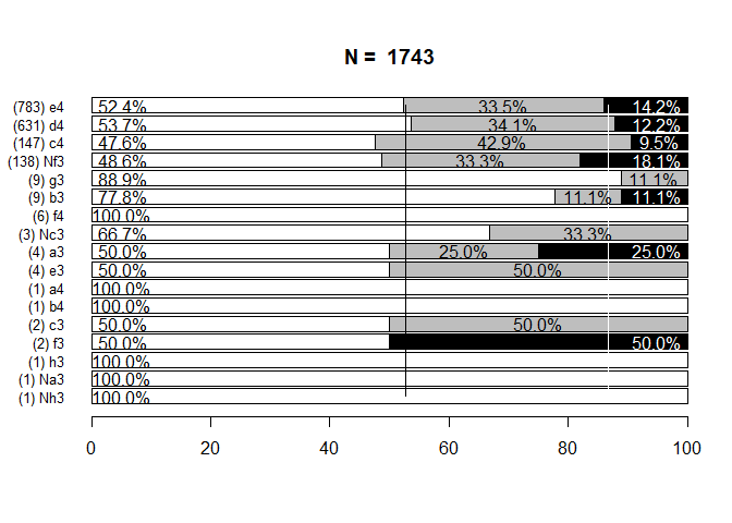
Winning percentage by Opening Hand
The R package bigchess has some interesting functions, such as browse_opening which can explore the winning percentage by opening moves:
bo = browse_opening(subset(df, grepl("Carlsen", White)))
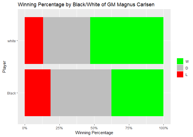
Winning distribution
winpct = games %>%
  count(player, MC_result) %>%
  group_by(player) %>%
  mutate(freq = n/sum(n))

winpct %>%
  ggplot(aes(fill=MC_result, y=freq, x=player))+
  geom_bar(position="stack", stat="identity") +
  coord_flip()+
  xlab("Player") +
  ylab("Winning Percentage") +
  scale_fill_manual(values = c("green", "grey", "red"))+
  ggtitle("Winning Percentage by Black/White of GM Magnus Carlsen") +
  scale_y_continuous(labels = scales::percent) +
  theme(legend.title=element_blank()
        )